

Tracking Anchor Protocol's Growth
Tracking Anchor Protocol's Growth
Three categories of metrics Anchor Protocol can implement to track its growth

Since its inception 8 months ago, Anchor Protocol has grown to be the backbone of a handful of protocols on Terra and a core selling point to onboard new users to Terra.
On its homepage, Anchor highlights the total value locked (TVL) in the protocol. Although TVL is attractive and easy to comprehend, it doesn’t paint the full picture of a protocol’s growth.


Given that Anchor is a protocol for savings and borrowing, supplementary metrics to accompany TVL should center around user and activity growth. Here, I would like to propose 3 categories of metrics Anchor can adopt to track these growth.
Platform users: Total users and daily/monthly active users
Daily anchor activity: growth of collateral added (by amount) and daily UST deposit change
Growth of UST deposited by address
Category 1: Tracking platform users
Total number of users
The first metric we can track is the total number of users who have used the platform to date. I’m defining platform users as any wallet who have interacted with Anchor to deposit UST, borrow UST, etc, excluding claiming airdrops.
Total number of users coupled with TVL give us a sense of whether a protocol is actively used by the community or if it’s only a select few individuals bringing the TVL numbers up.
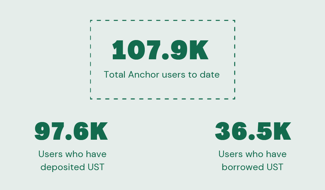
From this, we see that the savings proposition of Anchor remains the main driver for its user growth as 90% of Anchor users have deposited UST. On the other hand, only 30% have borrowed UST. More on this bit collateral in the next section.
An interesting fact here is 10% of users who have used Anchor have never used its savings feature. They were only using Anchor to borrow UST against their collateral.
Daily/Monthly Active Users
Going one level deeper, we can use the same definitions to figure out the daily/monthly active users on Anchor. Active here is defined as performing any transaction on Anchor including depositing, withdrawing, borrowing and repaying UST and depositing and withdrawing bLuna/bEth collateral.

The graph above shows the number of daily active users on Anchor. Over time, we see it has increased from about 2k back when it launched in March to about 6 - 8k in the recent months.

A more high level view on the monthly active users in the graph above might be a more suitable view for the public to gauge the growth of the protocol rather than a daily view. We can call out achievements such as ‘monthly active users have grown 5x in the past 8 months.’
Category 2: Tracking daily activities on Anchor
Amount of collateral added
Anchor relies on the collateral provided to be able to generate 20% APY for depositors. However, collateral like bLuna and bEth are volatile and hence tracking collateral value by USD prices do not tell us what exactly is increasing - net collateral deposits or collateral price.
Instead, I’m proposing that we track the net amount of collateral added instead like in the graph below.

As the volume of UST deposits increase, we know that the growth of collaterals need to follow the same trend to be able to continue provide 20% yield to depositors.
Breaking it down by collateral also helps to identify if a specific collateral is on an obvious downtrend (which means more of that collateral is withdrawn than deposited) and that could be something people can look into.
Daily net UST deposit
Following the same thought process of identifying activites on Anchor, another interesting metric we can look at is the daily net UST deposits into Anchor as it shows us both the short term and long term trends of the savings feature’s usage.
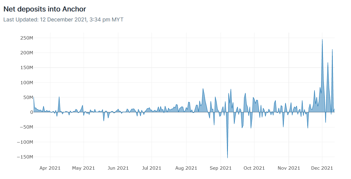
When we map this out, we can make short term trend observations such as in the recent weeks, there is a lot of inflow to Anchor savings where we see spikes of +200M on some days.
The same can be done for outflows. There was about 150M UST withdrawn from Anchor on September 7 and the community can look into what might be causing this behavior.
On a longer time horizon, we can compare the number of days where the net UST change is positive. Just by looking at the graph we can sorta guess that the majority of the days see a positive net daily change which means the UST deposits on Anchor are on an uptrend since launch.
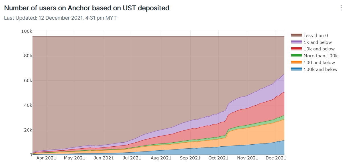
Category 3: Growth of UST deposited by address
We know that the amount of UST deposited is increasing over time but how much UST each address have deposited in total into Anchor? Are the deposits dominated by whales or are there more retail users who deposits say 1k in total into Anchor savings?
Snapshot of total Anchor deposits by address on December 10, 2021

In the graph above, I took a snapshot of the total amount of UST one has deposited into Anchor on December 10, 2021 based on several buckets.
19.7% of Anchor users have a total UST deposit of 10k and below.
If were to aggregrate some of these buckets, 52.1% of wallets have UST deposits of more than 0 UST to 10k UST.
We also see 32.7% of users have deposited UST at some point but at the time of snapshot, have completely withdrawn all their UST. This represents Anchor’s churn rate.
Total Anchor deposits by address over time
Alternatively, we can see view this metric as a function of time in the graph below
On a broad level, we see that number of wallets for most of the buckets are increasing. Wallets holding more than 100k UST on Anchor does not seem to have increased as much as compared to the other buckets which is expected since there are just more retail consumers than whales.
Having this metric publicly might be incentives for people to deposit more into Anchor - you can think of it as a vanity badge or achievement to indicate 'I’m in the 10k UST club’.
Conclusion
Given that Anchor Protocol has gained so much traction since its launch, it can benefit from having a more robust public metrics dashboard. In this article I proposed some of these metrics divided into 3 broad categories:
Platform users: Total users and daily/monthly active users
Daily anchor activity: growth of collateral added (by amount) and daily UST deposit change
Growth of UST deposited by address
To organize my thoughts of the various metrics proposed, I came up with this effort vs impact scale to better visualize which should be prioritized.
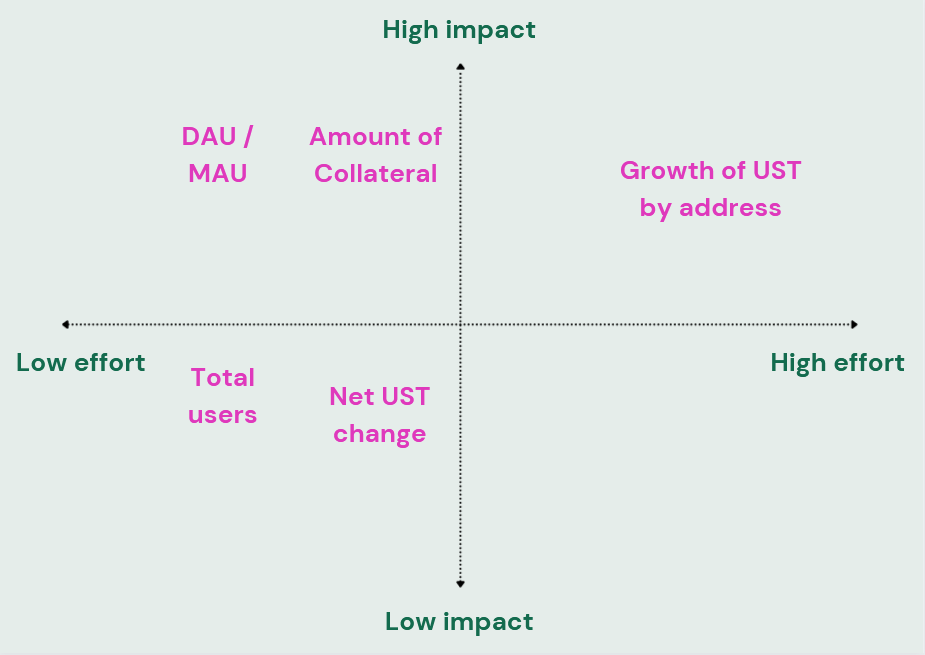
My thought process behind the placing for DAU is that by showing the daily active users (DAU/MAU), it makes it easy for the community to share this metric across to onboard more users onto Anchor / Terra.
The amount of collateral (not in USD) also informs users on the risk-on/risk-off behavior of other people in Terra. Hence these two metrics would belong in the high impact category and they seem easy to keep track of.
Growth of UST by address on the other hand I feel might take more effect to implement given how it might be tricky to track the increase in wallets based on the buckets. I do feel it can have a high impact in building more loyalty in using Anchor.
Last but not least, while total users and net daily UST change are interesting and easy to implement, it might not have as much as an impact as the other ideas. These are quick wins for sure but I would prioritize DAU/MAU over these for now.
Full interactive graphs: https://app.flipsidecrypto.com/dashboard/tracking-anchor-protocols-growth-2tzn9X
Here’s to better Anchor metrics 🥂